|
|
Post by stockpicker on Feb 12, 2014 10:41:23 GMT 7
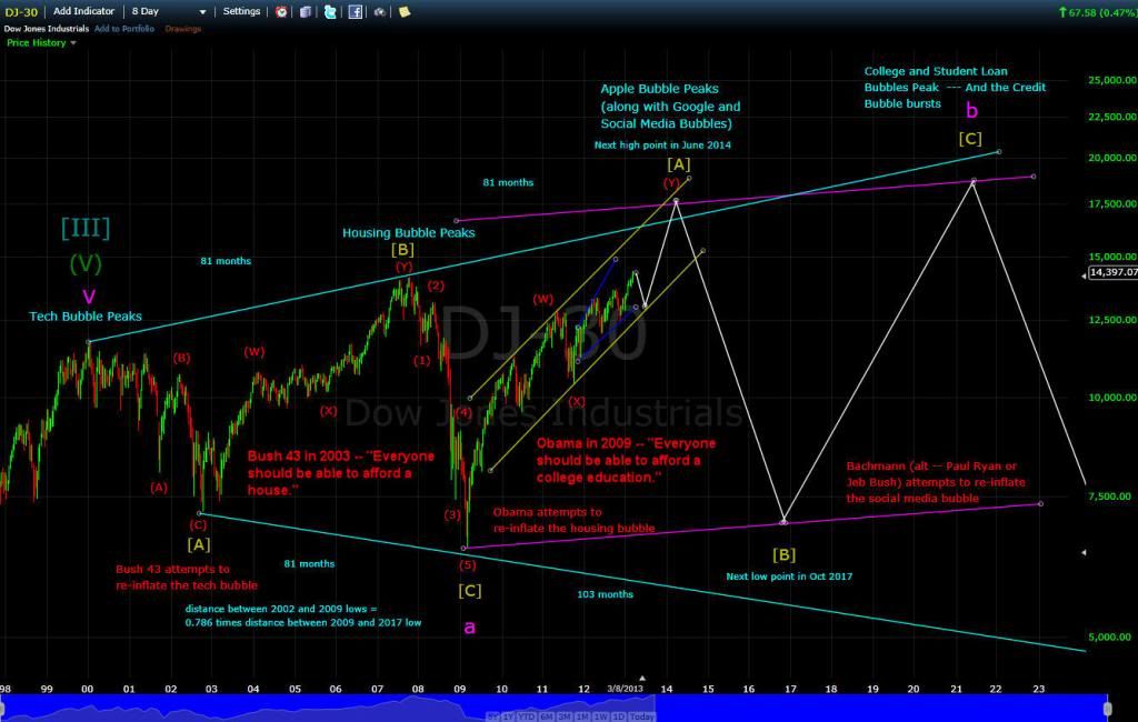
This article suggests that the present US market development is mimicking the 1929 chart and tells pple how to deal with the coming crash. ciovaccocapital.com/wordpress/index.php/stock-market-us/how-to-deal-with-the-scary-1929-parallel-chart/It said that the present US market was forming a "head and shoulder(HS) pattern" although the chart presently looked bullish. The following chart draws quite similar conclusion using DJI. 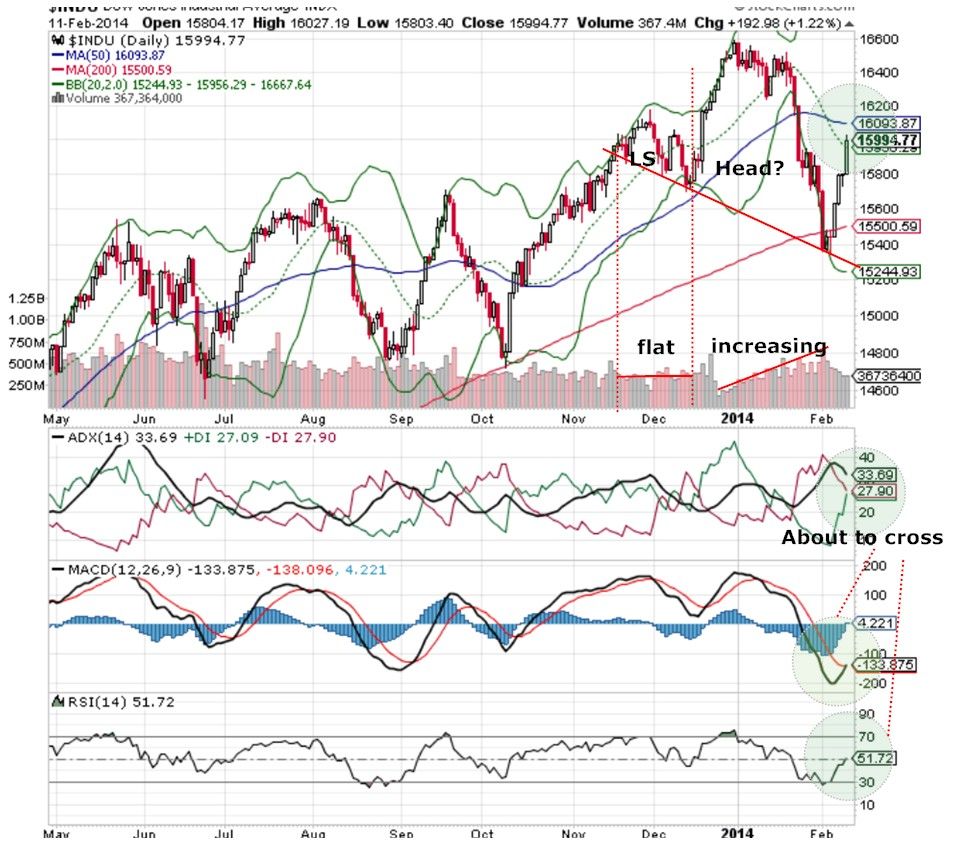 The standard textbook said that there are 2 warning signs for the HS pattern creation; first, the volume should build up when forming the left shoulder; then, the volume should increase also when the price decreases from the high after forming the head. The first condition may not always be true though the second, is a must. The DOW's present chart fits the description. The chart also show that DOW is presently bullish with ADX, MACD and RSI all about the cross for a buying spree. Hope everything would be fine finally. Many analysts have said in the newspapers that there are still plenty of rooms for market to make another new high.. |
|
|
|
Post by zuolun on Feb 12, 2014 11:39:32 GMT 7
|
|
|
|
Post by candy188 on Feb 12, 2014 23:43:00 GMT 7
Another article that is bearish on 2014 market outlook.  Why 2014 Is Looking More And More Like 2007 Why 2014 Is Looking More And More Like 2007If there is an investment theme I would follow in 2014, it would be this: Preserve your capital, be worried about the economy, and don't for a second believe that key stock indices are going to provide returns like they did in 2013. This year may just be the year when the floor is taken out from beneath stock prices. Why am I so bearish on 2014? It's because I believe a perfect storm is in the making for key stock indices. Finally, from a technical point of view, key stock indices aren't looking very attractive. Look at the chart below to see what I mean.  After Friday's payroll numbers, key stock indices like the S&P 500 had their best day since October (circled area in the chart above). But one critical thing happened on Friday: trading volume fell.
==> A stock market rising on WEAK VOLUME cannot be characterized as a rebounding market.2014 looks more and more like 2007 to me (more on this in the next few days). This article suggests that the present US market development is mimicking the 1929 chart and tells pple how to deal with the coming crash. ciovaccocapital.com/wordpress/index.php/stock-market-us/how-to-deal-with-the-scary-1929-parallel-chart/It said that the present US market was forming a "Head and Shoulder(HS) pattern" although the chart presently looked bullish.The following chart draws quite similar conclusion using DJI. The standard textbook said that there are 2 warning signs for the HS pattern creation;
(1) first, the VOLUME should build UP when forming the Left Shoulder;
(2) then, the VOLUME should INCREASE also when the Price decreases from the high after forming the head. The first condition may not always be true though the second, is a must. The DOW's present chart fits the description. The chart also show that DOW is presently bullish with ADX, MACD and RSI all about the cross for a buying spree. Hope everything would be fine finally. Many analysts have said in the newspapers that there are still plenty of rooms for market to make another new high..
|
|
|
|
Post by zuolun on Feb 13, 2014 7:15:06 GMT 7
|
|
|
|
Post by stockpicker on Feb 15, 2014 10:24:24 GMT 7
For some reasons, the World's stock market is mixed. The giants, Shanghai, Germany and the US markets except Tokyo are still bullish, whereas Singapore is bearish. Hong kong, Tokyo, India are getting weaker by the day. Hopefully, the giants can help to push the coming market but they are themselves reaching overbought region and ready to make corrections
|
|
|
|
Post by stockpicker on Feb 15, 2014 10:40:45 GMT 7
|
|
|
|
Post by stockpicker on Feb 16, 2014 12:01:30 GMT 7
The comparison between DJI, HSI, SSEC, CRB & STI shows the positions of various indexes. As pointed out earlier, DJI, DJT and CRB are in a value chain and they should go hand in hand i.e when they wandered, they should eventually meet. skyjuiceiswater.blogspot.sg/2014/01/whats-wrong-with-this-chart.htmlIf we were to take CRB as a norm, here we will see DJI has wandered up and there is a lot of rooms for corrections. As for HSI, a correction is nearly done. STI and SSEC may have over-corrected and should pull up.. Please note that the above assumed that that CRB is the norm and it might not be the case. However, one can see that the indexes, except for DJI under the influence of QEs (alcohol ?), are always pulling back to meet CRB after they have wandered around. This Phd in Commerce was of the same view that there were something wrong between the relationship between the commodity price and the stock market price which usually would go hand in hand; for example, copper price did not rise when economy is said to be recovering and also coal price did not move in a very very cold winter. The commodity prices are telling a scary story... finance.yahoo.com/blogs/breakout/as-the-stock-market-comes-back--commodities-tell-a-scarier-story-175327750.html?l=1 |
|
|
|
Post by stockpicker on Feb 21, 2014 9:45:05 GMT 7
|
|
|
|
Post by stockpicker on Feb 21, 2014 10:05:56 GMT 7
It is good to take note that the Phil Index went up only by 0.37% after having dropped more than 1% on Wednesday which spur the selling in Asian market. It is likely that last night's hike in US markets may be just a speculation that "keeps the wheel moving". It is good to be cautious until the banks are excited.. 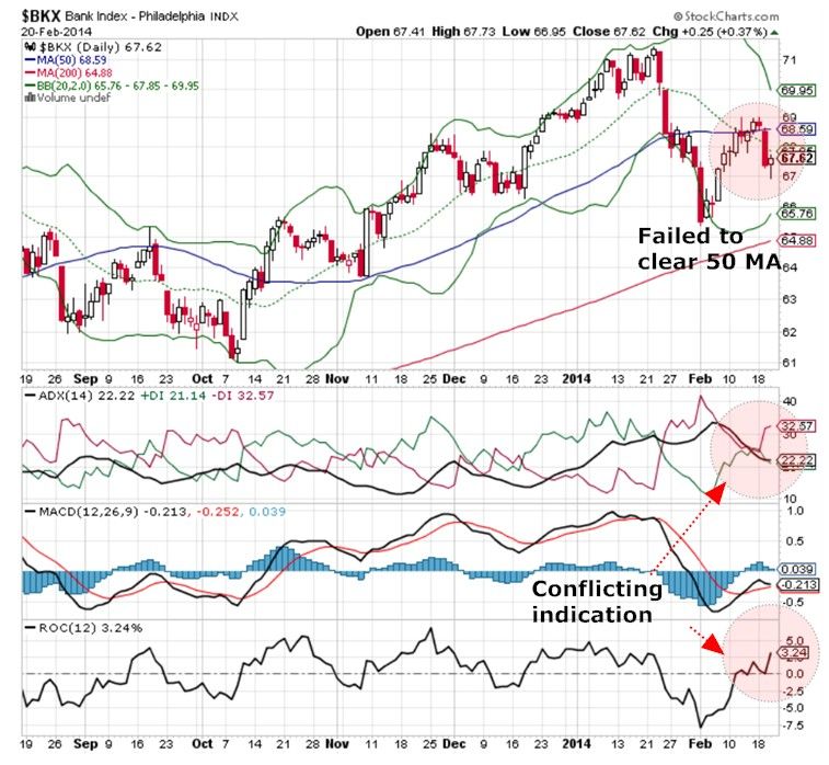 |
|
|
|
Post by zuolun on Feb 23, 2014 13:00:28 GMT 7
文茜世界財經週報 — 16 Feb 2014
|
|
|
|
Post by stockpicker on Feb 23, 2014 17:23:07 GMT 7
Ichimoku chart has been used by many analysts but it is quite complex with so many Japanese line making it very hard to understand and to master but it is a powerful chart. It tells many stories; among them, 3 lines are most frequently used; a) Conversion line(black); b) the base line (red); c) the lag line (green). The conversion acts as a support/resistance for the price; it also signals a buy when crossing above the baseline and vice versa. If the lag line stay below the price line, it is bearish;otherwise, it is bullish. Sometime, the cloud acts as resistance but sometimes, don't. The ichimoku chart shows that DOW has a buy signal last Thursday with the conversion line crossing above the base line. 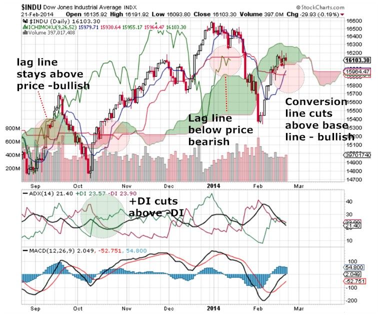 Comparing to the same situation in Oct 2013, this time, the lag line is bearish. This controversial appears to suggest that DOW may not be as bullish, particularly when the +DI and -DI are still mingerling to find a position . It may suggest that DOW is forming the right shoulder if DOW can cross below and runaway from 15,400 and be supported by volume. |
|
|
|
Post by stockpicker on Feb 27, 2014 8:58:42 GMT 7
DOW is presently going nowhere after having a failed breakup on Monday, 24 Feb 2014. Then FTSE100 broke 14 year high with G20 vowed to lift their collective GDP by at least an extra 2% over the next five years and HSBC reported a 9% rise in profit. S&P also hit a record intraday high with DOW rallied 133 points up. However, DOW and S&P could not keep the highs and eventually, S&P and DOW closed lower with record volumes. This record volume has become significant as it shows that there were BBs showing interests and the day's high (16300) and low (16100) will determine the resistance and support for the next move; furthermore, 24 Feb is a Monday which is usually a quiet day. Should DOW breaks above 16300, it would want to go up quickly as the shorting BBs will take cover; otherwise, when it goes below 16100, the buying BBs will dump. 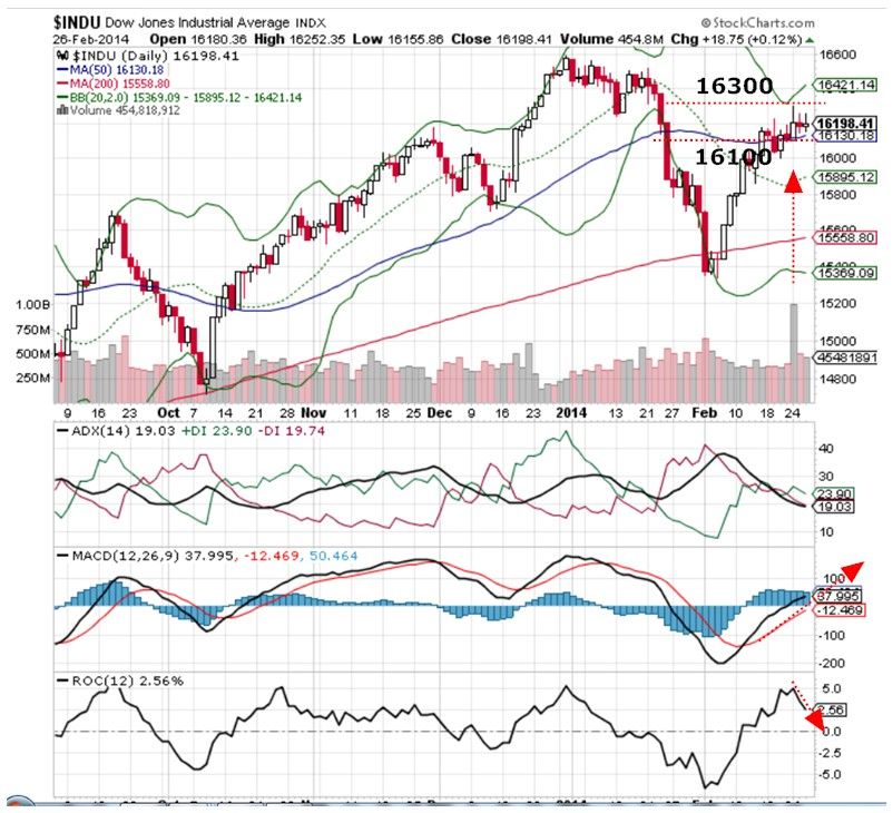 |
|
|
|
Post by stockpicker on Mar 1, 2014 10:46:26 GMT 7
DOW and the US market went against the current to end positive last night with DOW going just above 16,300. However, the break above 16,300 was not impressive and it was pulled back at the end of the session which denoted some weaknesses. DOW ended up only 0.3% with light trading volume. The sentiment may have been affected by the lower GDP estimates for 4th quarter and the tension in Ukraine although the PMI and US sentiment indicators went up with some good news from Europe. The weakness can be seen on this CPCE call put ratio chart which shows that the 3MA has been going up indicating some are accumulating puts ready for the killing. If CPCE changes its pattern subsequently to following B pattern; then, there is a good chance for US markets to make more steam and continue to climb. On the other hand, if CPCE were to follow A pattern, do expect a serious correction to come. 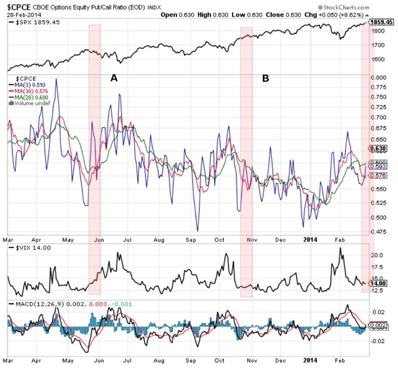 |
|
|
|
Post by stockpicker on Mar 1, 2014 18:37:31 GMT 7
This picture shows just how much the US 10 year yield has climbed in the past 9 months as compared to the other indices and stocks. It must have affected the cost of doing businesses and hurt the growth of US economy in general. The TNX chart shows that it is doing higher highs and higher lows although it has taken a slight breather recently. It is observed that the climbs of the housing and bank indices have been suppressed recently. 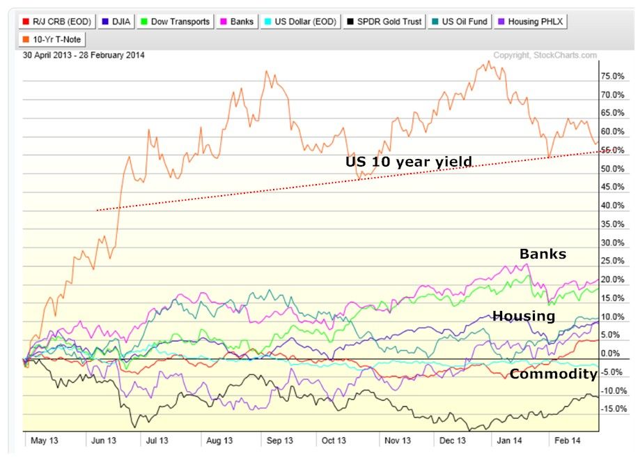 This other chart will show that TNX is finding support at the 200-day MA and is appearing to take off once it can overcome the pressure to push the price lower. The next target should be above 3% unless the 200-day MA support is broken. 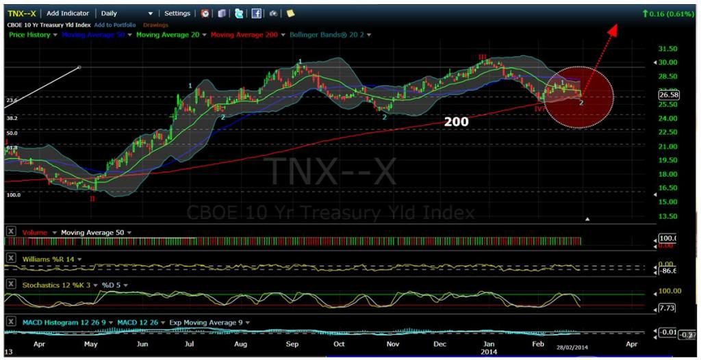 |
|
|
|
Post by stockpicker on Mar 3, 2014 7:58:50 GMT 7
Many would have thought that the Ukraine war has nothing to do with the World's stock market performance but judging from today's market response, this is not quite true. The Europe and US futures are down by more than 1% and Nikkei shed about 3% for 2 hours of trading. Whether they will recover is a matter to be observed later. Why Ukraine war has such effect? For this, we will have to examine what affect it will have on Russia. Russia's economy has not been performing well since 2011 with ruble falling from about 28 to 1 USD to now about 36 to 1 USD. It is estimated that this Ukraine war will cost Russia about 3% of its GDP and don't forget Russia is the one of the largest creditors of US debts. people.howstuffworks.com/5-united-states-debt-holders.htmThink.. where would Russia get its money to fund the war? www.businessinsider.sg/how-russia-will-impact-the-market-2014-3/#.UxPRM-Vgh3A |
|